What does book design mean when layouts are no longer created page by page? When content updates automatically, systems make decisions, and design works through rules, structures, and algorithms? And what role does print play when web, code, and analog techniques intersect?
The project explores the tension between automated work processes and contemporary book design. Instead of traditional layout software, the focus lies on systemic thinking, fixed rules, and networked content. Automation enables new forms of production: content can be updated live, publications emerge from dynamic sources, and print often becomes a by-product of a larger, hybrid system.
Drawing on historical and current forms of automation—from lead typesetting to digital standards and web-to-print—the project examines both visible and invisible design rules. Topics such as hybrid publishing, print on demand, system design, Paged.js, open source, and AI form the basis for experimental and systematic approaches.
The resulting works highlight interfaces and symbioses between web-based design and analog techniques. Print is not replaced, but recontextualized.
The publications consciously work with processes, formats, and limitations. Automation is understood not only as a tool for efficiency, but also as a creative and artistic method to reveal, question, and rethink existing systems.
The website & book present all projects created during the seminar—eight different positions on automated publishing that frame and expand the course chapters. Within these chapters, the course content is reflected and complemented by exercises and selected example outcomes.
The goal is to offer readers an easy and low-threshold introduction to the topics covered in the seminar—mirroring our own learning experience.
In this seminar, we examine the constitution of the book under the conditions of automated processes. What design is appropriate for current knowledge production today?
Automation has shaped book design since Gutenberg: from lead typesetting, which determined font sizes and grids, to phototypesetting and desktop publishing, which opened up new freedoms but was also shaped by grid principles and software logic.
For centuries, the typographic grid determined the order of text, images, and white space—while today, digital standards such as Unicode and EPUB define which characters can be displayed and how texts are structured and distributed on platforms.
Each medium and each technology brings its own logic, structures, aesthetics (and biases). Which of these fit with our viewing habits today? Which design rules will still be relevant in the future?
In pairs, we analyze and question the visible and invisible rules, systems, and algorithms of book production and publication. In the context of current developments such as print on demand, e.g.: www.apod.li and web-to-print, e.g.: https://prepostprint.org/resources/, we explore new possibilities for algorithmic, systematic design.
Practical experiments result in books and publications that address, challenge, or outsmart the automation of book design, production, and distribution. Each group develops the “content” individually through a systematic process according to self-imposed rules on a topic of their choice.
Thus, it is not only about the efficient implementation of layouts and print templates, but we also use the formats, processes, and restrictions creatively and artistically.
| Date | Content |
|---|---|
| 15/10 | Introduction to the topic |
| 22/10 | Systems & Book Design |
| 29/10 | Web-To-Print 1 |
| 05/11 | Web-to-print 2 |
| 12/11 | Grid / Layout / InDesign Scripting |
| 19/11 | Print On Demand |
| 26/11 | Project Idea Presentation |
| 03/12 | Compile content |
| 10/12 | Project work |
| 17/12 | Interim presentation |
| 24/12 | (Christmas) |
| 31/12 | (Christmas) |
| 07/01 | Project work |
| 14/01 | Project work / Evaluation |
| 21/01 | (BaMa colloquium week) |
| 28/01 | Final presentation |
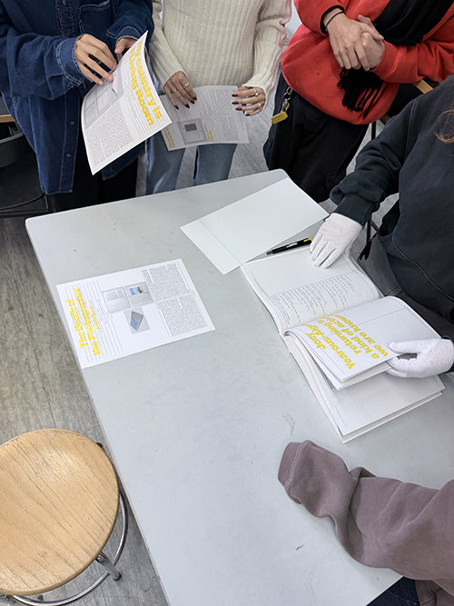
Please look at (individual work) contemporary and antiquarian books and distill from your findings at least three conventional and three unconventional rules from microtypography (typesetting, detail typography, orthotypography) and macrotypography (layout).
Please scan or photograph these findings and print them out in black and white on A3 paper.
Please write down the rule—as short as possible, as long as necessary— as a single line on the A3 paper below the image.
What rules were found? How are the rules formulated? -> Possible corrections
!disclaimer! The printing functions of browsers are often still uncared-for, buggy and imprecise, so be prepared for glitches and paradox situations.
Examples:
Frameworks:
Paged.js follows the Paged Media standards published by the W3C (ie the Paged Media Module, and the Generated Content for Paged Media Module). In effect Paged.js acts as a polyfill) for the CSS modules to print content using features that are not yet natively supported by browsers.
in the HTML head. 🙌 Great, we are ready for our first book layout.<script src="js/paged.polyfill.js"></script><link href="css/interface.css" rel="stylesheet" type="text/css" />
Click on the “Print” button of your browser. (It will most likely be in File > Print or, on your keyboard, CTRL/CMD + P)
General settings for the page:
@page { size: A5;
        margin-top:
        10mm;
        margin-bottom:
        10mm;
        font-family:
        'Franklin Gothic Medium',
        'Arial Narrow', Arial, sans-serif;
        @bottom-left { content:
        counter(page); } }
Options for left and right page:
    @page:left {
                        margin-left: 10mm;
                        margin-right: 20mm;
                        @top-left {
                            content: "Chapter";
                        }
                    }

                    @page:right {
                        margin-left: 20mm;
                        margin-right: 10mm;

                        @top-right {
                            content: "Hybrid Publishing";
                        }
                    }
In the @media print query we can include all the styles that we want ONLY to appear in the print
@media print {
                        html, body {
                            height: 99vh;
                            margin: 0;
                            padding: 0;
                          }
                }
To avoid loading the print preview already on the first load we can include the following little script:
<script>
                        window.PagedConfig = {
                                auto: false
                        };
                </script>
(<script
          src="js/paged.polyfill.js"></script>)
and then create a button to call the preview:
 <button class="noprint"
          onclick="preview()">print preview</button>
<script>
                //this will load paged.js and generate the PDF preview
                function preview(){
                        window.PagedPolyfill.preview();
                }
                </script>
with the noprint class we can hide elements in
the print version in @media print
.noprint{
                        display: none;
                }
Paged.js breaks the HTML content into multiple pages.
With CSS properties we can control that flow.
.chapter
                {
                break-before: page;
                }
to break the page before every
.chapterelement
Setting bleeds:
@page    {
                    bleed: 6mm;
                }
Setting up crop marks:
@page {
                    marks: crop;
                }
Add content before:
.note::before {
                    content: "Note: ";
                }
counters: (e.g. for counting images)
body {
                    counter-reset: figureNumber;
                }

                figcaption {
                    counter-increment: figureNumber;
                }

                figcaption::before {
                    content: counter(figureNumber);
                }
generated images:
.glossary::after {
                    content: " " url("/images/glossary-icon.png");
                }
showing links:
a::after {
                    content: " (" attr(href) ")";
                }
Running title with header:
h3 {
                    string-set: title content(text);
                }

                @page {
                    @bottom-center {
                        content: string(title);
                    }
                }
page templates
.frontmatter {
                        page: frontmatterLayout;
                }

                @page frontmatterLayout {
                        /* specifics rules for the frontmatter*/
                }
select specific page
@page:nth(5){
                }
Creating a table of contents is a bit more tricky, but doable with some JS / CSS:
https://pagedjs.org/posts/en/build-a-table-of-contents-from-your-html/Building an index:
https://pagedjs.org/posts/en/build-an-index-with-pagedjs/Parallel flows:
https://pagedjs.org/posts/en/parallel-flows-within-paged.js/Cross references:
https://pagedjs.org/en/documentation/-cross-references/Experiment with CSS styles and content ~
Many more options can be found in the reference: https://pagedjs.org/en/documentation/
Download the imposition.js: https://gitlab.coko.foundation/pagedjs/pagedjs-plugins/booklet-imposition/-/raw/master/imposition.js?ref_type=heads\&inline=false
Include in the index.html (! after the paged.js script):
<script
          src="js/imposition.js"></script>
In the CSS under @page add the following:
--paged-layout: booklet;
Now if you click CMD+P the layout should be layouted as a booklet and ready to print!
https://pagedjs.org/posts/en/parallel-flows-within-paged.js/
Use the Text and the Rules you formulated in the last exercise and make a booklet using only paged.js.
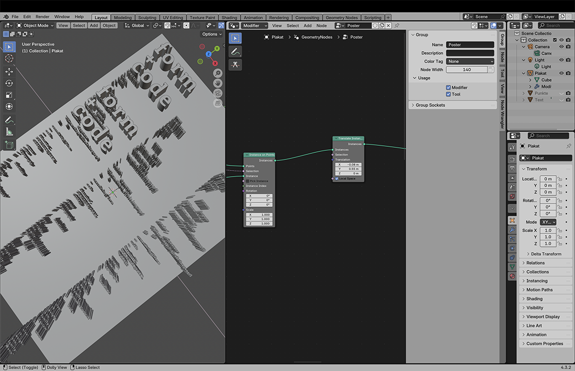
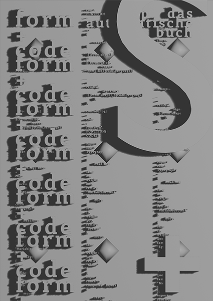
Please work in GROUPS OF TWO to design a DIN A1 poster (digital only) using a new tool of your choice on the topic: Design = System.
Please use at least one of the following readings as a reference and then explain what you have taken from the reference.
Please roll the dice for the most important design parameters:
Please bring two to three layouts per person as a group in a PDF file. (always roll the dice again :)
In the UXP Dev Tools click create plugin
https://developer.adobe.com/indesign/uxp/static/34d8a6a31d12429b5c05ae1879c42001/e3dad/create-plugin.webpMy First Plugin
├── manifest.json
├── index.html
└── index.js
You can click run and watch to test it
In the index.html you can add elements:
<div class="wrapper">
                                    <h3>Hello World!</h3>
                                    <button id="btnCreateText">Create Text</button>
                                </div>
commands and panels.
InDesign Document Object Model
const myInDesign = require("indesign");

                            const app = myInDesign.app;
let doc = app.activeDocument;
app.documents.add();
doc.pages;
                            doc.pages.length;
add an entrypoint for the panel functions
entrypoints.setup({
                                commands: {
                                    showAlert: () => showAlert()
                                },
                                panels: {
                                    showPanel: {
                                        show({node} = {}) {
                                            const btn = document.querySelector('#btnCreateText');
                                            if (btn) {
                                                btn.addEventListener('click', createText);
                                            }
                                        }
                                    }
                                }
                            });
This is an event listener for the button;
    page = doc.layoutWindows.item(0).activePage;
                                const bounds = [12 + counter, 12, 72 + counter, 200]; // top, left, bottom, right in points (shifted down by counter)
                                counter = counter + 10;
                                const textFrame = page.textFrames.add({ geometricBounds: bounds });
                                textFrame.contents = "hello world";
 const rect = page.rectangles.add({ geometricBounds: bounds });
                            rect.strokeWeight = 2;
    // add a new page to the document
                                const newPage = doc.pages.add();
                                // make the new page the active page in the layout window
                                doc.layoutWindows.item(0).activePage = newPage
const p = doc.pages.item(i);
      for (let i = 0; i < doc.pages.length; i++) {
                                    console.log(i)
                                    const p = doc.pages.item(i);
                                    const pageBounds = p.bounds;
                                    const leftMargin = pageBounds[1] + 12;
                                    const bounds = [12 + counter, leftMargin, 72 + counter, leftMargin + 188];
                                    const textFrameOnPage = p.textFrames.add({ geometricBounds: bounds });
                                    textFrameOnPage.contents = String(i);
                                }
The bounds of the Page, in the format [y1, x1, y2, x2].
Official Tutorial:
https://developer.adobe.com/indesign/uxp/plugins/getting-started/InDesign DOM Api
https://developer.adobe.com/indesign/dom/api/d/Document/Take an essay from Library of Artistic Print on Demand and at least 4 examples from the book.
Cut out (as a group assignment) an essay from the publication “Library of Artistic Print on Demand” and at least 4 examples of artistic works.
Rebind the pages.
Read the text and prepare 4–5 slides on the most important insights from the essay, making it accessible to others.
Think about how you could implement a print on demand project (within the infrastructure of the university) and how it could be well implemented in terms of design.
1 PDF as a group, please
Franzi & Tim
Lenny & Clara
Kristina & Edda
Johanna & Sooryeon
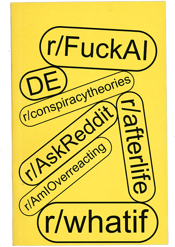
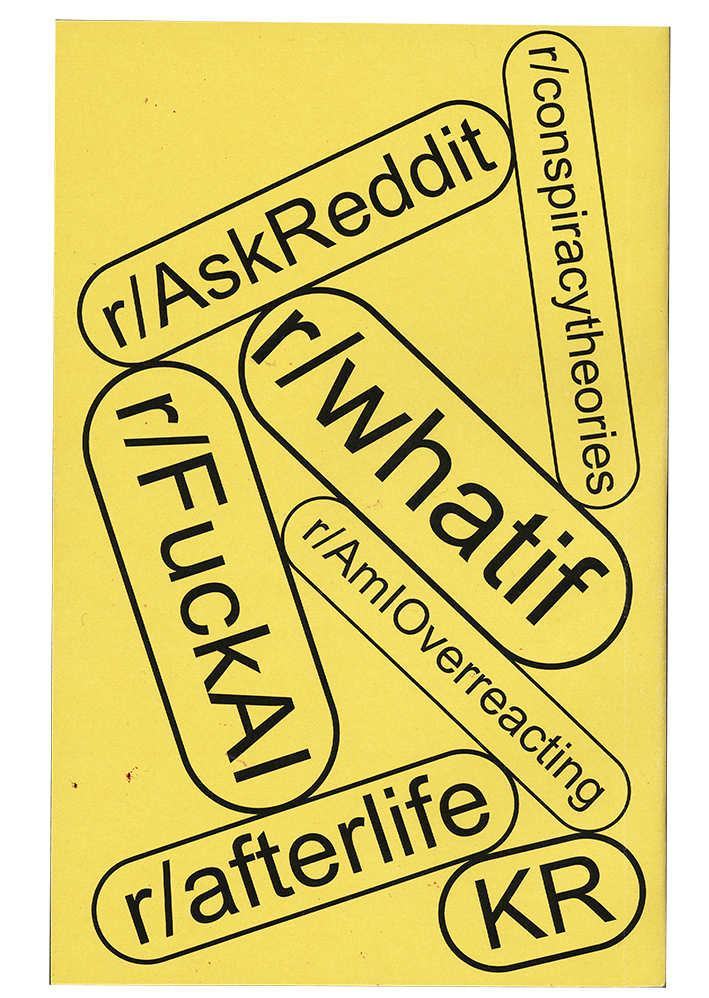
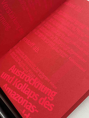
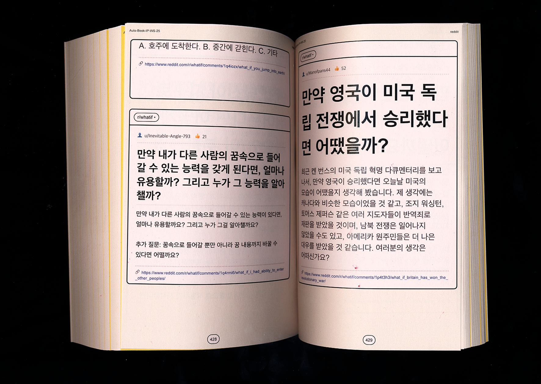
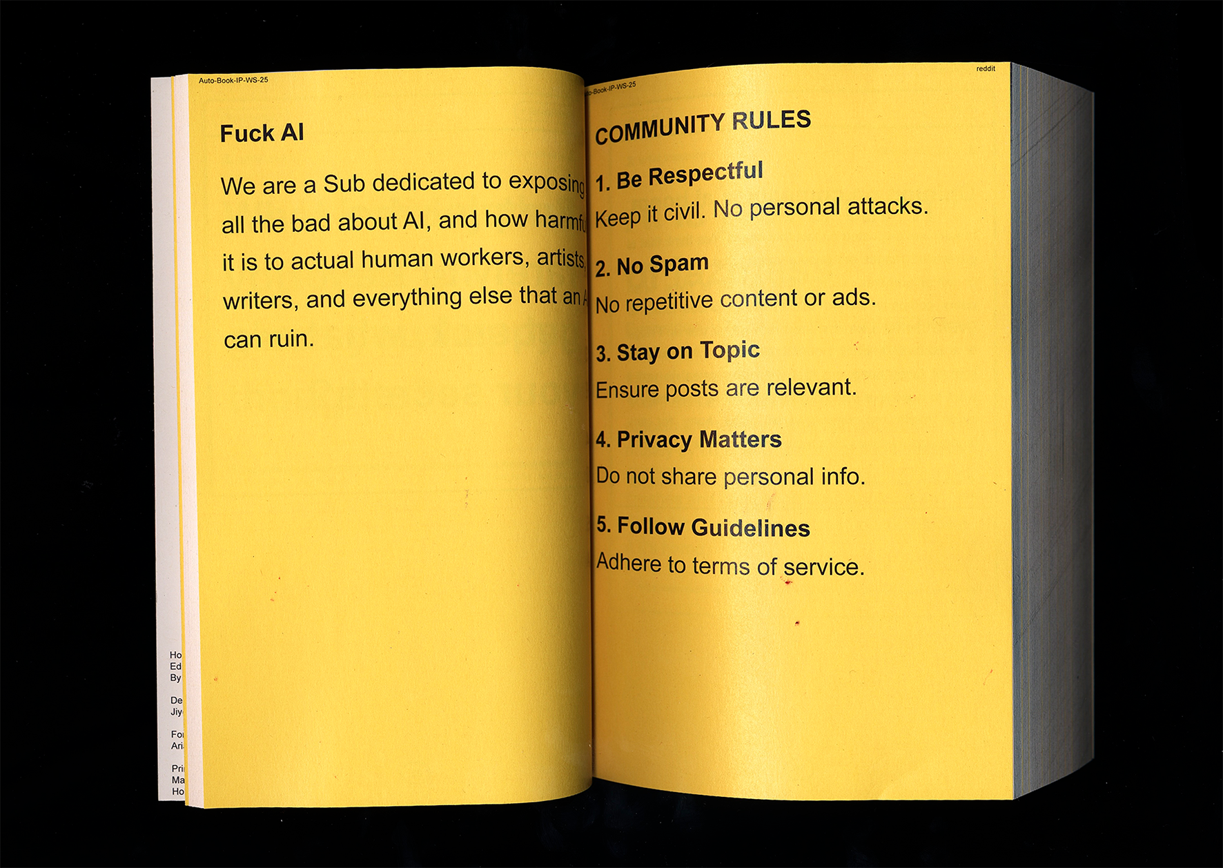
This project presents a book as an immersive scroll through online thinking. Rather than curating or explaining content, it recreates the experience of moving through Reddit, where people externalize everyday thoughts, fears, anger, and speculation. Posts often drift away from the present moment into imagined futures, worst-case scenarios, or emotional spirals. The project is motivated by the observation that fear of the future increasingly dominates online discourse. Technological anxieties and existential questions accumulate in digital spaces, making it difficult to stay grounded in the “now.” The internet becomes a shared environment where these thoughts are amplified, repeated, and validated.

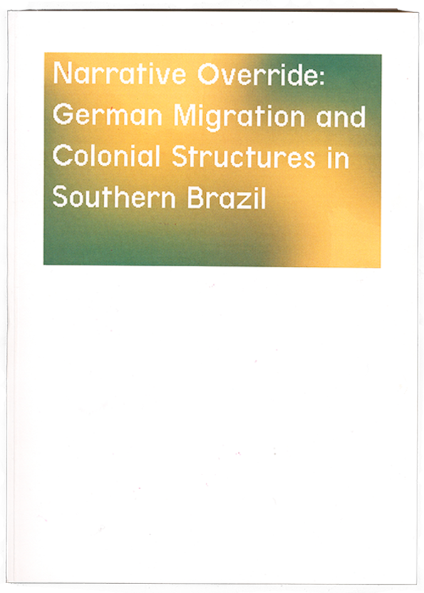
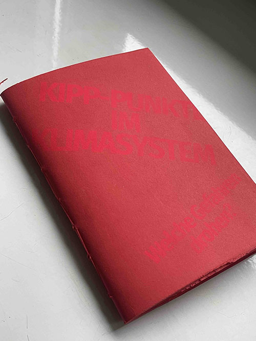
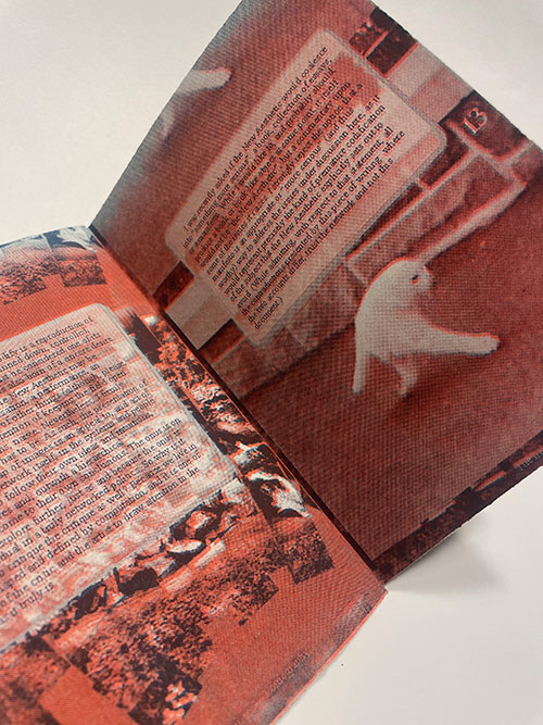
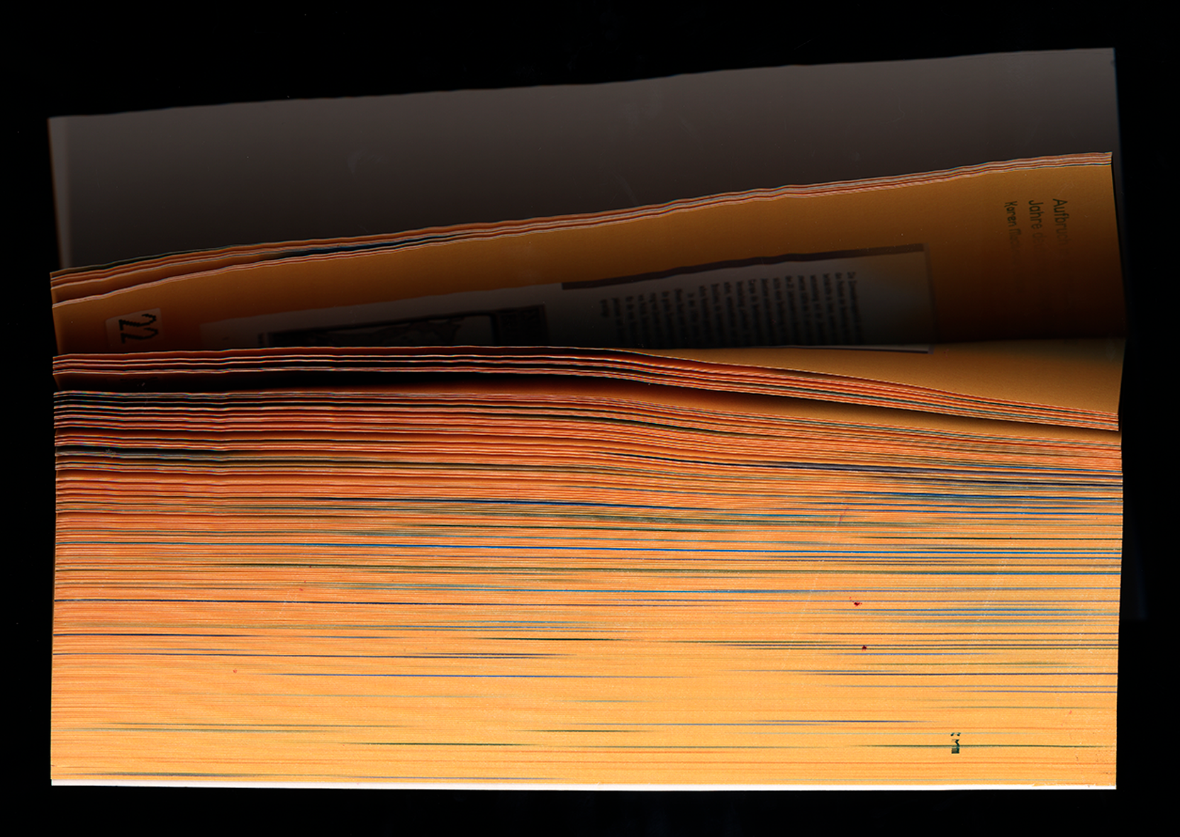
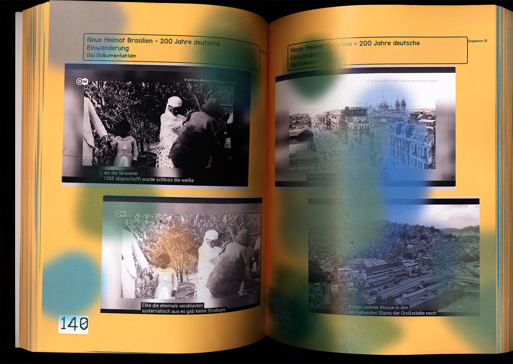
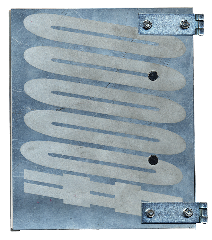
The project “Narrative Override: German Migration and Colonial Structures in Southern Brazil” collects and presents various historical sources on German emigration to southern Brazil in the 19th century. The aim is to make different perspectives on this migration accessible and to reveal how the history of settlement has been narrated.
Across the sources, stains spread according to an automated system that reacts to the properties of each visible source. They symbolize migration, displacement, the incompleteness of information, and its simultaneous visibility.
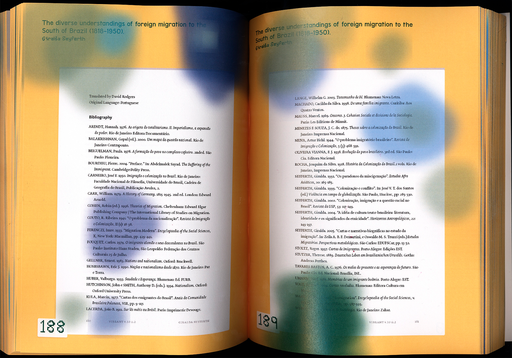
The project was developed in Visual Studio Code.
.png)
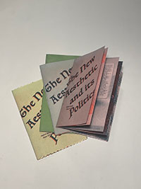
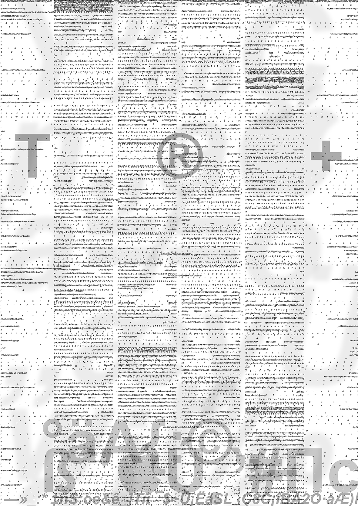
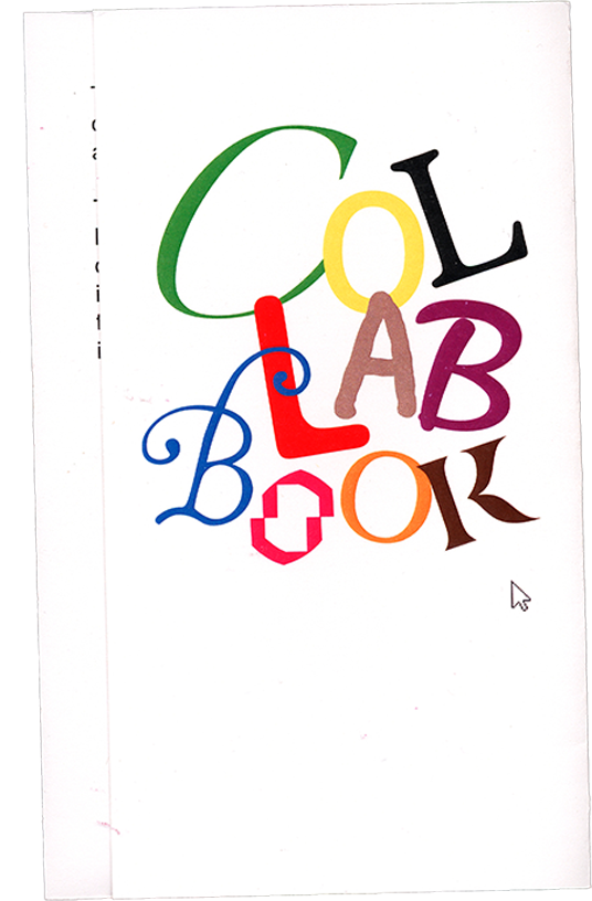
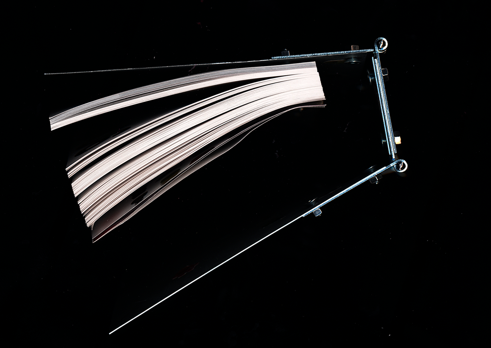
In this project, we attempted to design a collaborative book using a web tool that we developed ourselves. The tool was intended to enable multiple people to jointly create a layout. It is deliberately unpredictable, aiming to move users away from conscious decision-making and toward intuitive design and play. The individual design elements were therefore intentionally conceived in a humorous way as “tools.” The book itself is a collection of four texts from the field of design, laid out by more than 41 different participants across 146 pages.
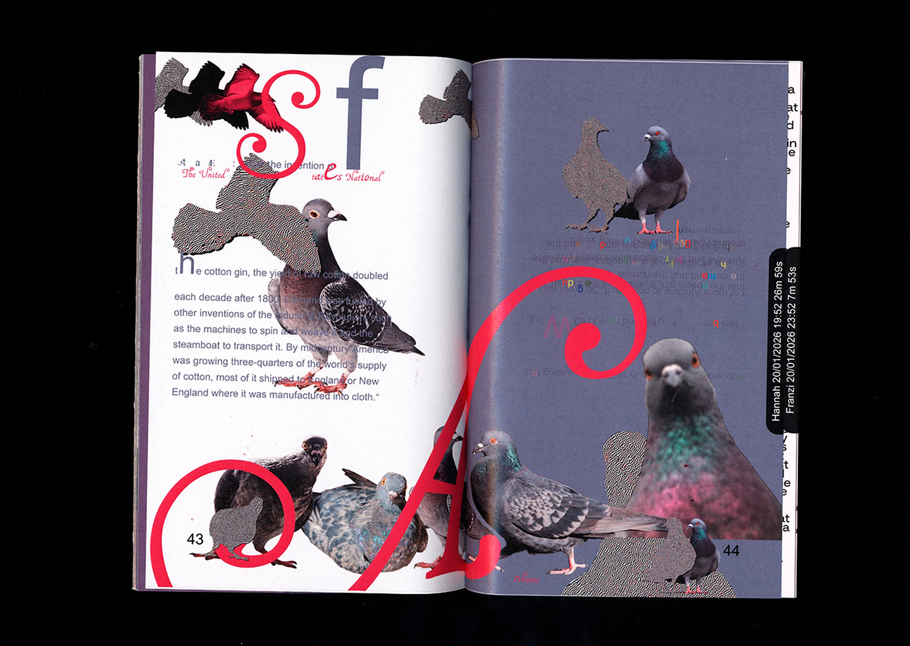
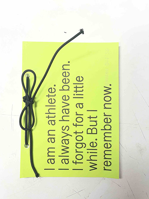
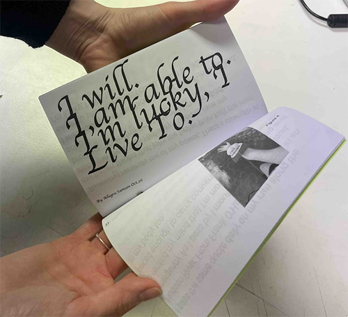
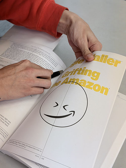
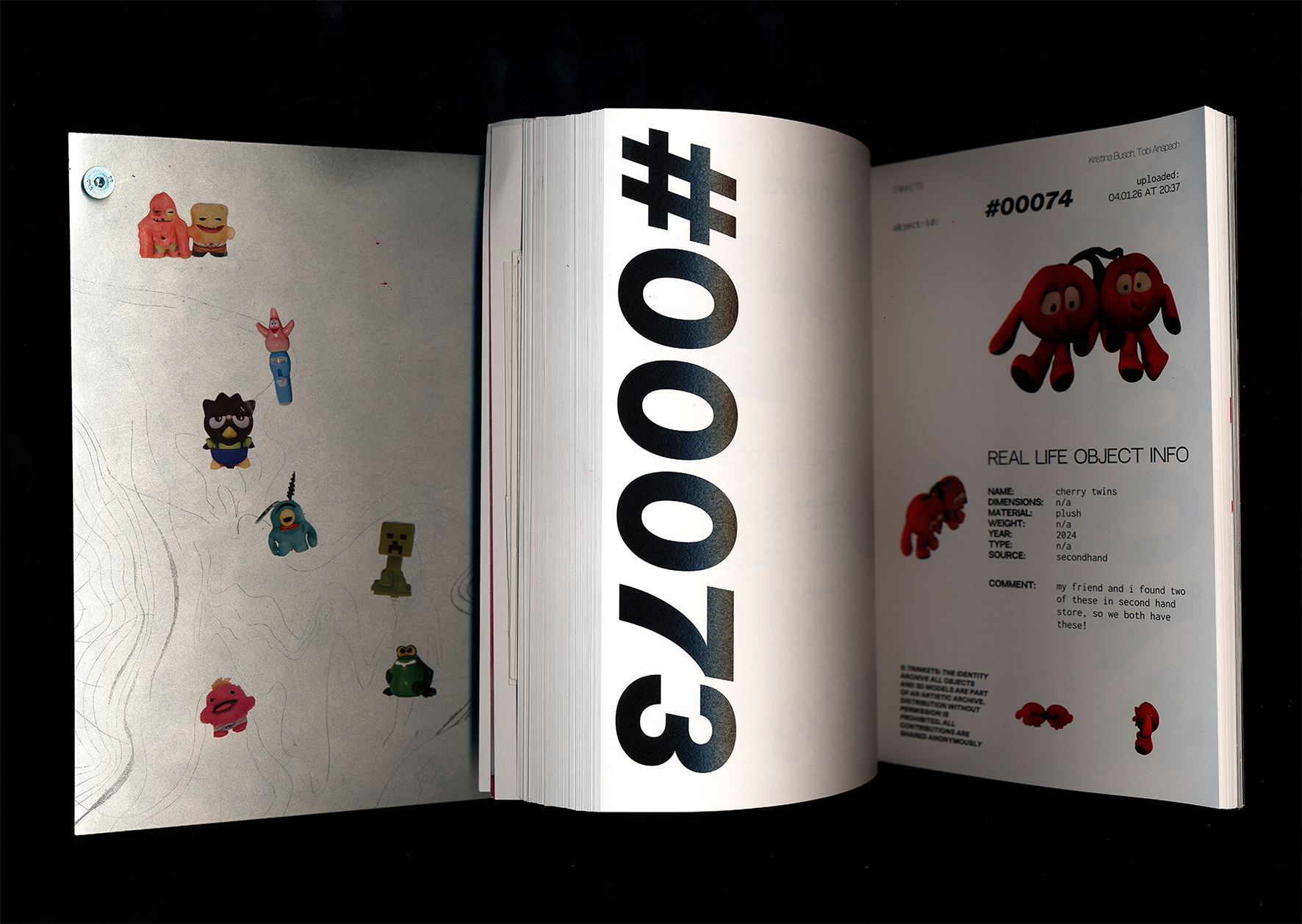
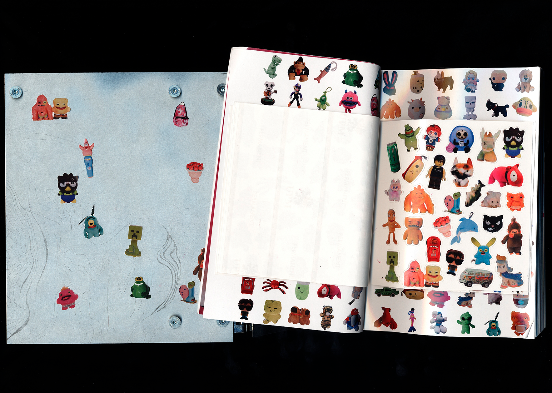
Theft is omnipresent. On a large and small scale, people steal and rob every day. From bank robberies, mask deals, and tax evasion to international wildlife smuggling, the list of thefts is long.
But you don't have to be a criminal to steal something. Not scanning something at the self-checkout, pocketing a mug at the Christmas market, crawling under the turnstile at Sanifair, or gaining access online to things you would actually have to pay for. All of this is theft (from a legal perspective).
In order to steal, someone else must own something, but how does a person acquire this property in the first place, and is it fair? The concept of theft is at least as old as the concept of ownership—they go hand in hand. To rise above theft is to forget its origins. If God exists, why didn't he leave me a condominium (Beslik - Guten Morgen Deutschland).
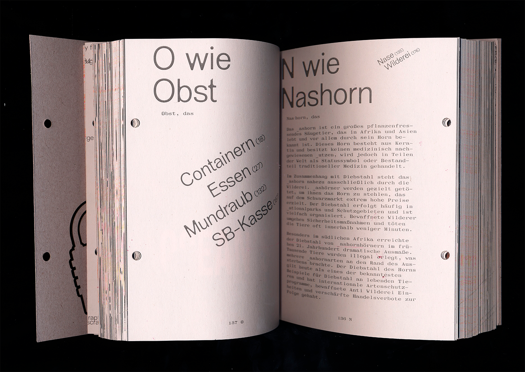
Where is the moral line? Are some forms of theft more serious than others? The theft shown here is mostly in a legal and moral gray area. As a kind of encyclopedia of stolen things (from A for “accordion” to Z for “quote”), supplemented by essays, this book takes a critical and humorous look at theft and shows the absurdity of certain forms of property.
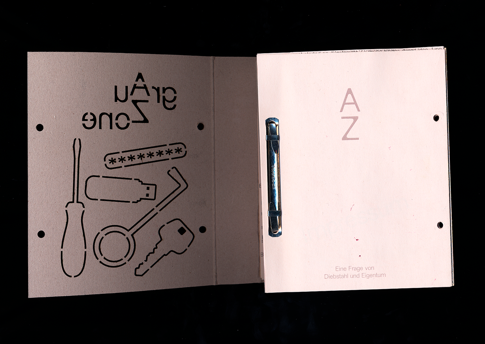
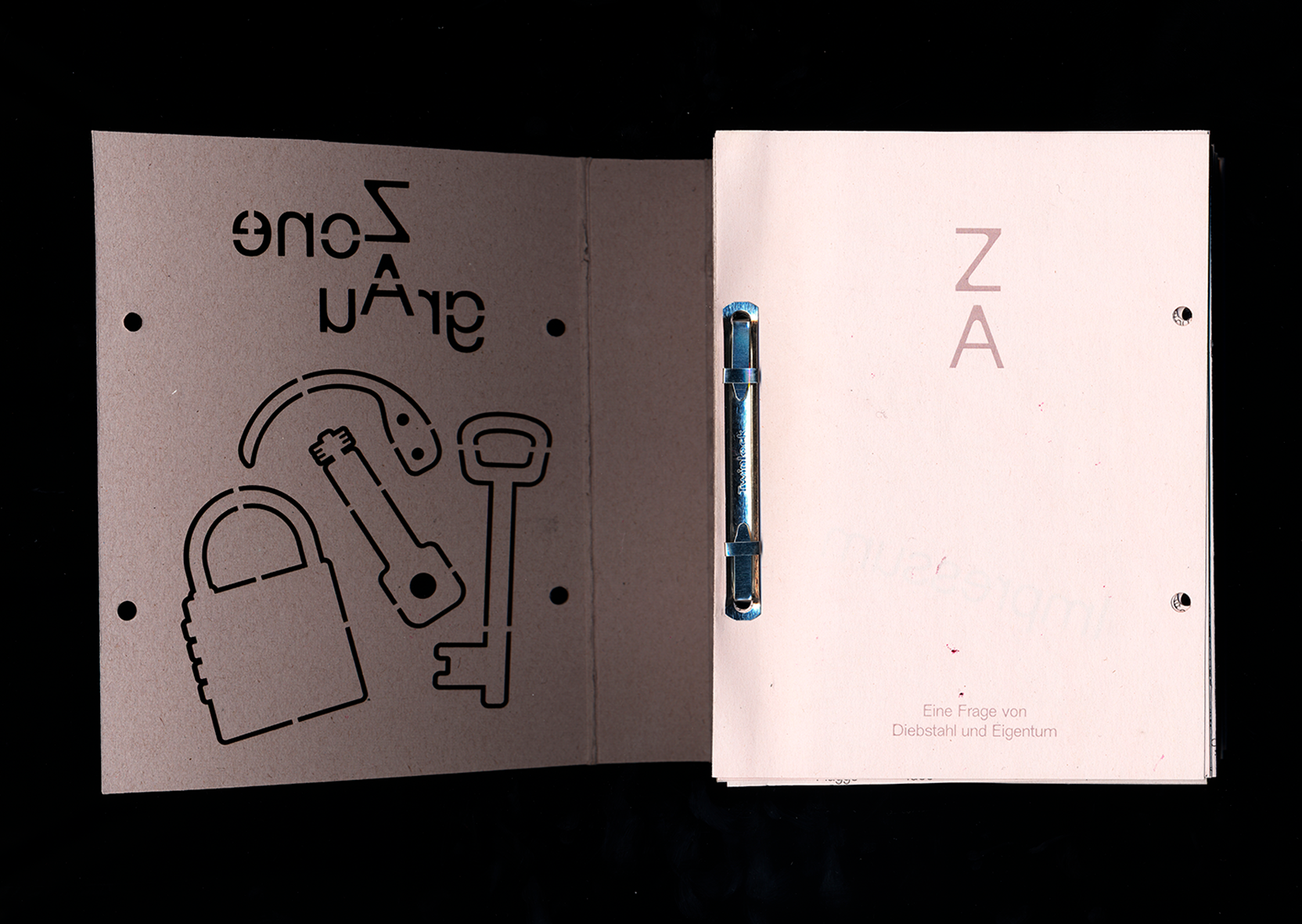
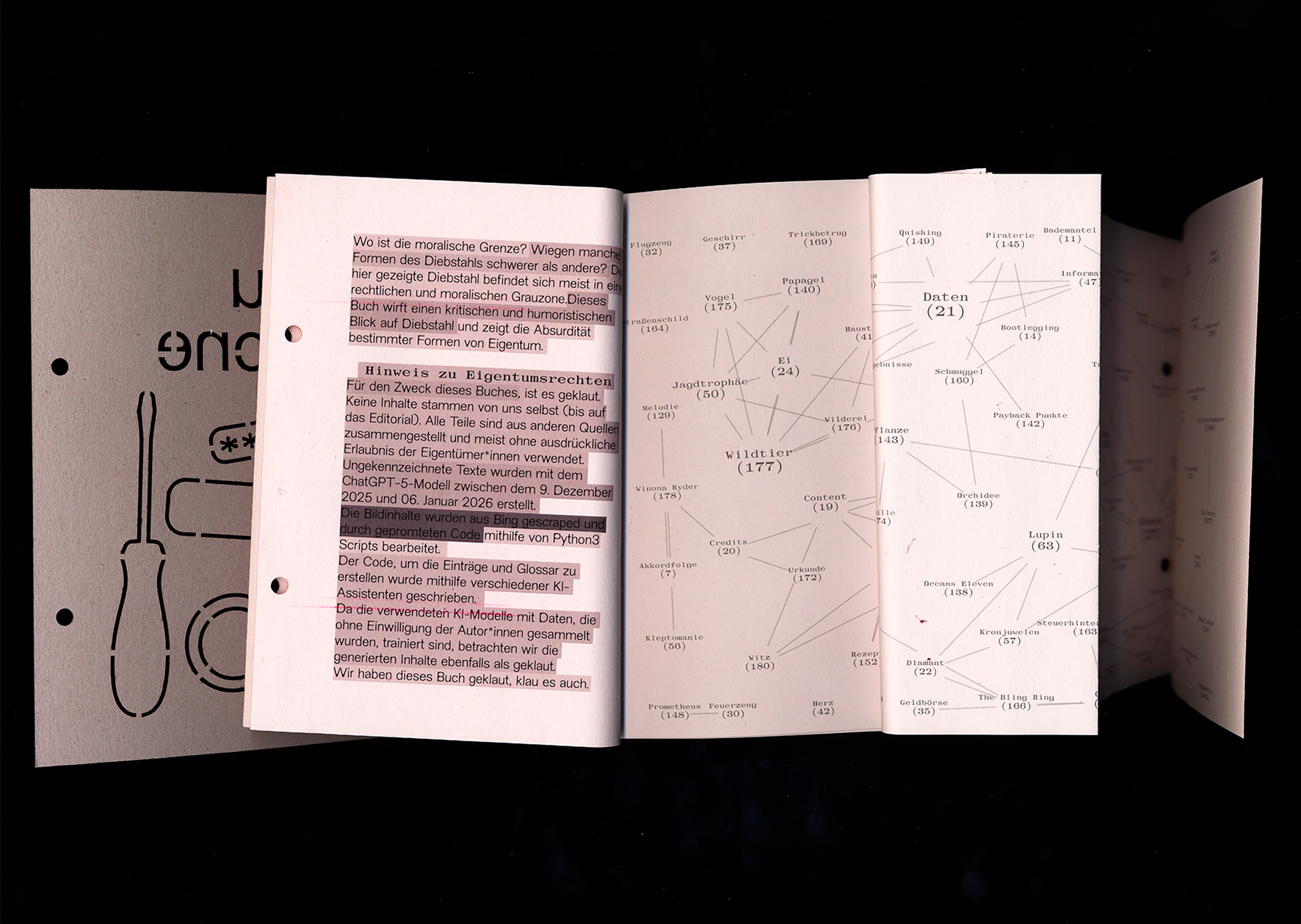
Technically, we worked on the illustrated book using Python scripts created with the help of ChatGPT.
Based on our outgoing CVS table, in which we collected terms related to the topic, images were scraped (downloaded) from the Bing search engine, edited and collaged using another script (all based on prompts—i.e., without our direct visual control), and then converted into the final PDF in book format.
The scripts were executed in the Mac command line terminal, which was written down in a txt file and later found its way into the book in a visualization.
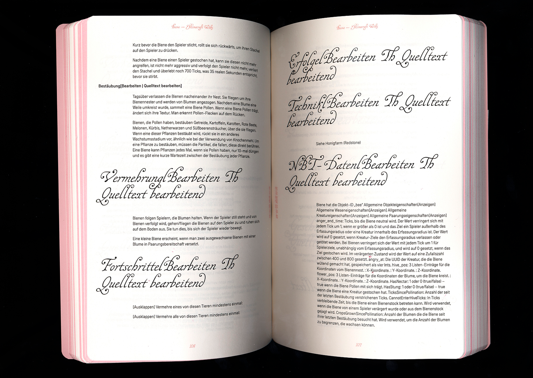
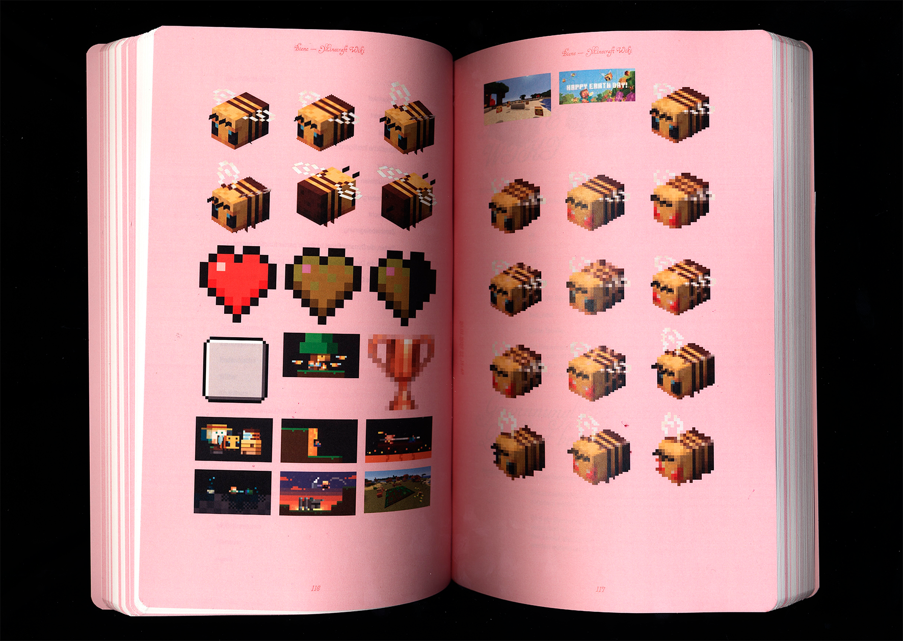
The text volume is based on the same table, from which the pages were created using JavaScript and pagedJS via web-to-print. Word breaks and articles were automatically extracted from Wiktionary. The references manually defined in the table form the basis for the glossary, which uses D3js for visualization.
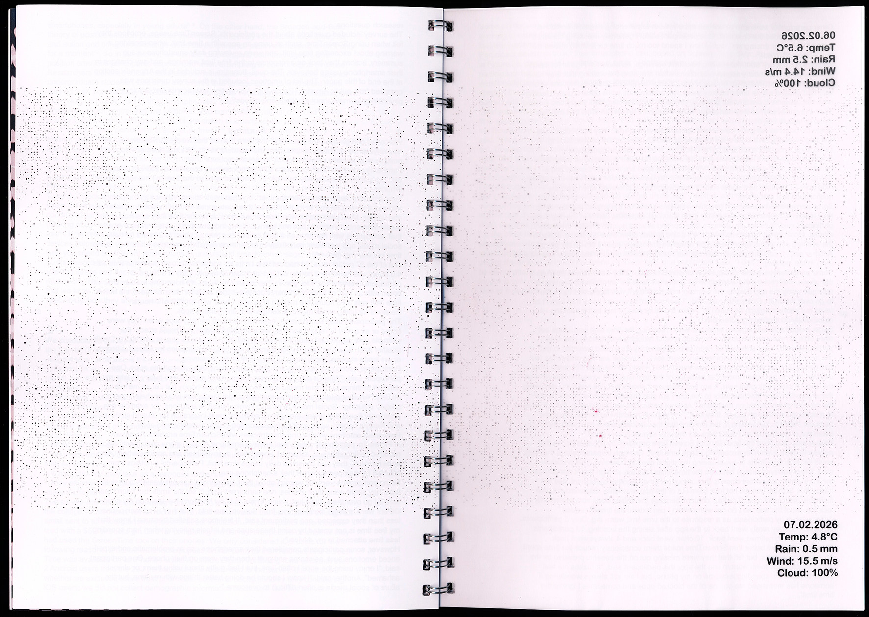
Our project investigates how automated digital data can be translated into a physical book format. We are working with current weather data as an example of fleeting real-time information that is quickly consumed and just as quickly forgotten in everyday life. Print on demand slows down this data and fixes it as a material object. Technology/Software The book is not intended to be a static publication, but rather a dynamic system that changes with every data update.
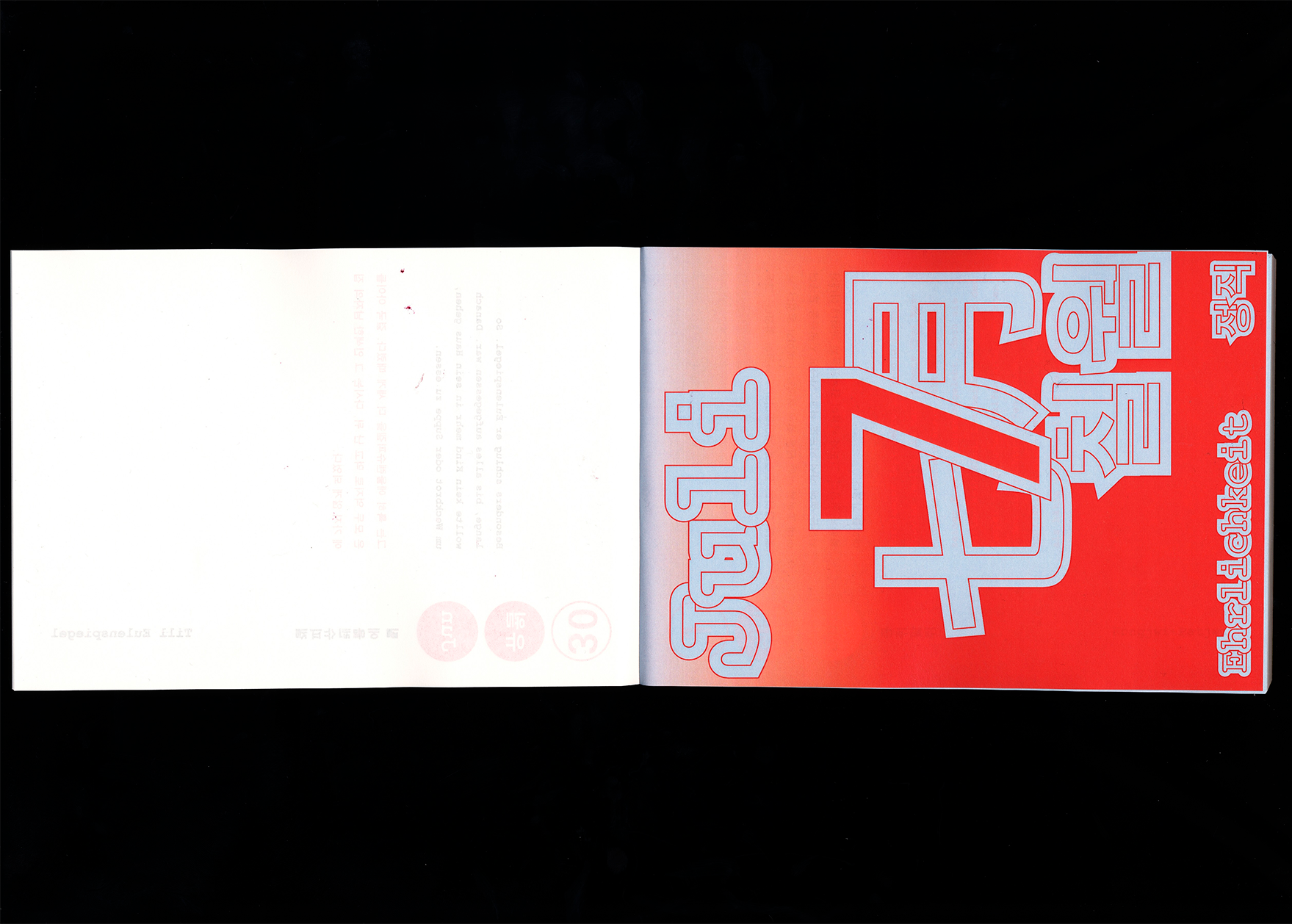
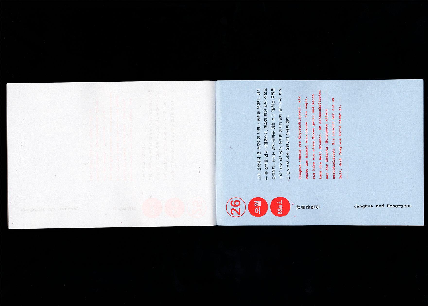
Our project combines language learning with cultural comparison.
The goal was to create a playful and visually engaging way to teach German and Korean through narrative content.
The project is based on six overarching themes, each represented by one German and one Korean legend or myth. This approach highlights similarities and differences between the two cultures and allows language to be experienced in context.
The overlapping logic of the website was deliberately omitted in the print version to ensure readability. Instead, the learning process is simulated through the daily focus on a single paragraph and the direct comparison of original text and translation.
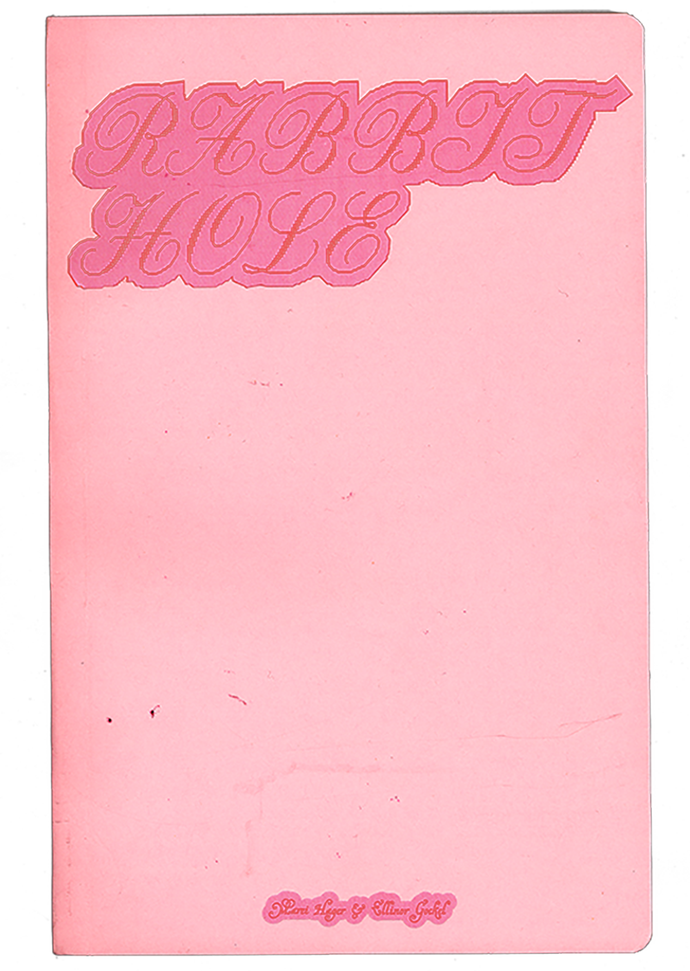
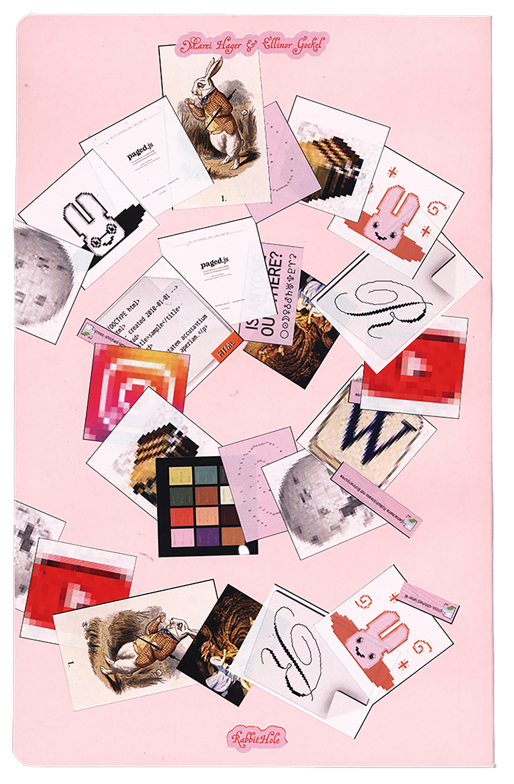
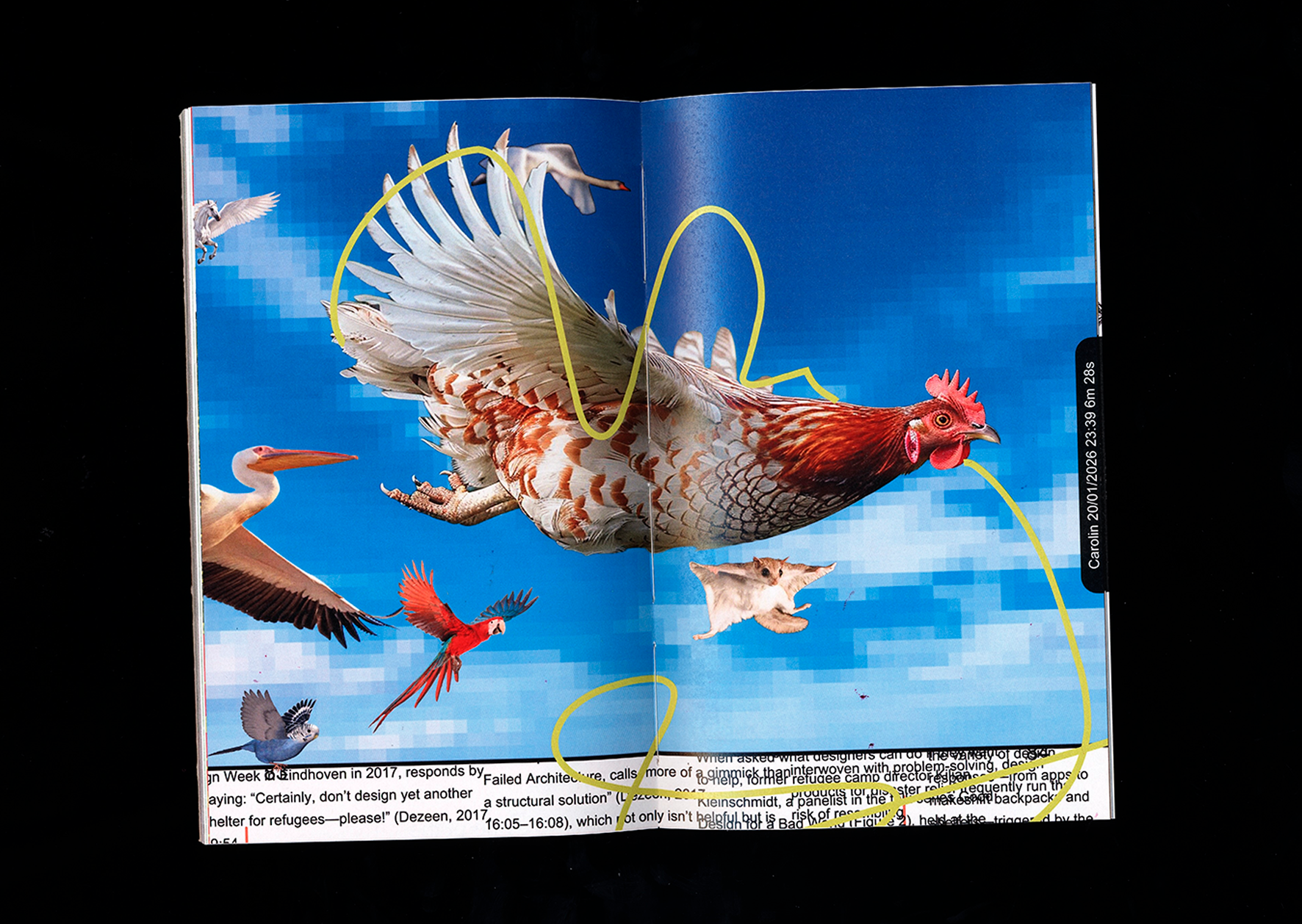
“Rabbit Hole” describes exactly what it is: a rabbit hole. With the help of a browser plug-in, users can record their personal rabbit hole with a click, save it as a PDF, and/or print it out directly. Content such as text, images, video thumbnails, GIFs, and emojis are automatically transferred to a document. Since we, as the designers of the tool, have no influence on the content, the design was made as universal as possible so that it works for any type of content.
paged.js
RISO – Mainz University of Applied Sciences
Printing & Paper – Mainz University of Applied Sciences
Salzer EOS, 60 g/sqm
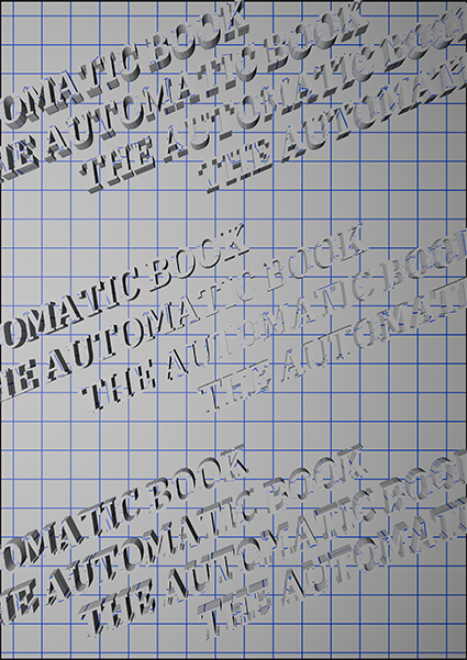
The Automatic Book
Alexander Roidl (Interim Professorship
in Communication Design)
&
Johannes Bergerhausen
(Professorship in Typography and Book Design)
Mainz University of Applied Sciences
Felix Stadler Marcos, Sophie Kunle & Annabel Scheffler